How Seattle and Eastside designers spec warm palettes and finishes for low winter light
If you run a studio in Seattle or across the lake on the Eastside, specifying warm palettes can quietly drain your time and your margins when the winter gray rolls in. Under our heavy overcast, cool grays and crisp whites tend to read flat, blue, or clinical. Designing homes in Kirkland, Bellevue, or Mercer Island requires a deep understanding of how the soft, blue-gray Puget Sound light interacts with interior surfaces.
Alcove at a glanceCentralize dimensions, finishes, and spec data per product.
Most studios already spend hours shifting away from cool, modern palettes toward warm neutrals and complex undertones long before a project starts. But managing these subtle variations — and keeping clients comfortable with warm tones on a dark, rainy Tuesday — requires precise specs and clear documentation.
The reality of Puget Sound light — why cool grays read cold
Alcove at a glanceTrack client approvals and decisions in one place.
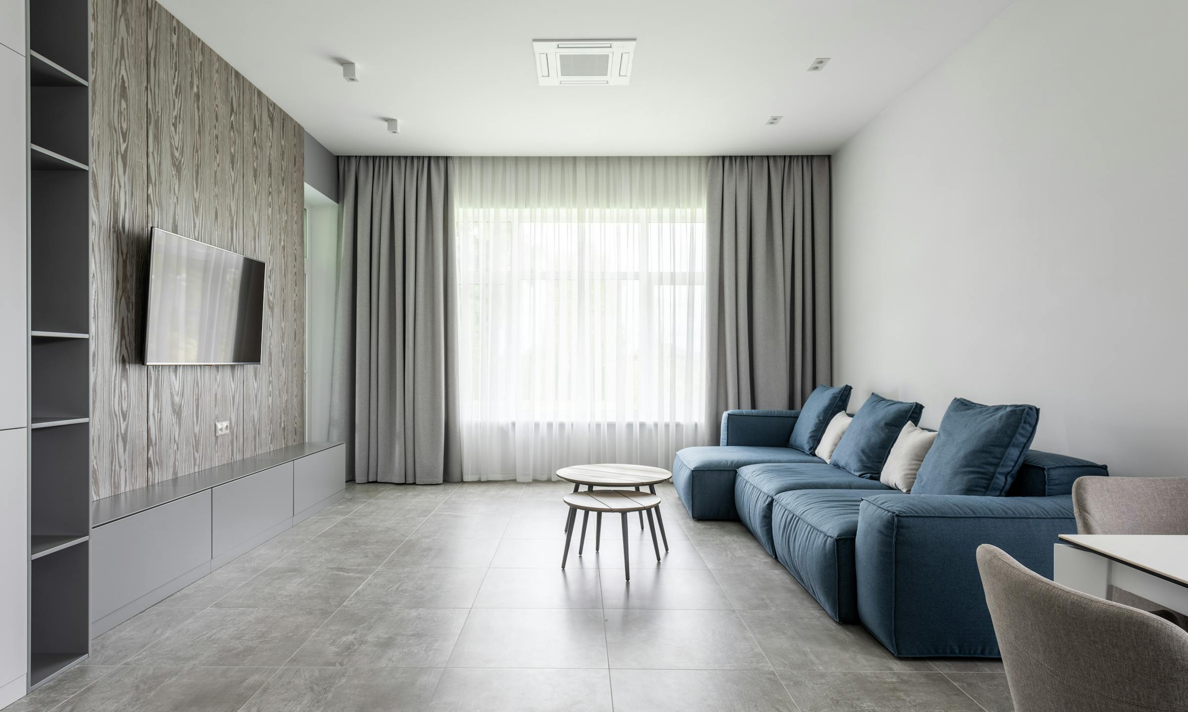
The Pacific Northwest is famous for its soft, diffused daylight. While this light is beautiful for art studios, its cool, blue-tinted quality behaves predictably on interior walls during the winter months. If you specify a cool gray or a stark, blue-based white in a home overlooking Lake Washington, the space will inevitably feel cold and uninviting for half the year.
To counteract this cool cast, local designers must lean into warm neutrals. This does not mean returning to the heavy, gold-toned beiges of the early 2000s. Instead, the goal is to build a palette of complex neutrals that hold their warmth without turning muddy when the clouds roll in.
Choosing the right undertones — paint and plaster specs that hold their warmth
Selecting paint for a Bellevue living room is rarely as simple as grabbing a standard white. Under a gray sky, those clean whites read as a dull, shadowy gray. To keep spaces feeling bright yet cozy, we specify warm whites with yellow, pink, or green undertones.
Consider these common specifications:
- Benjamin Moore Swiss Coffee: Often specified at 75% strength to keep it light while retaining its warm, creamy base.
- Sherwin-Williams Alabaster: A reliable, soft white that provides a subtle warmth without looking yellow.
- Benjamin Moore White Dove: A classic choice with a tiny hint of gray in the undertone — this keeps it soft rather than stark.
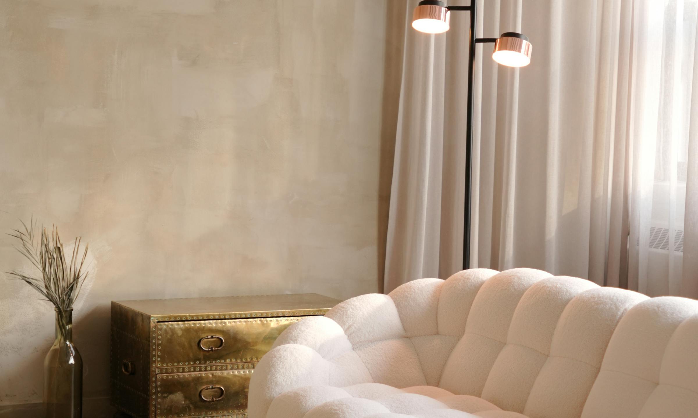
Sheen is just as important as color. High-gloss finishes bounce the cool exterior light directly into the room — emphasizing the gray sky outside. Instead, specify matte, flat, or chalky plaster finishes. Roman clay or lime wash finishes work beautifully in PNW homes. Their subtle, velvety texture diffuses the soft, directional light, scattering it gently across the room.
Balancing wood tones and stone — avoiding the yellow-orange trap
When trying to warm up a great room in a Kirkland waterfront home, it is easy to overcorrect. In an effort to avoid a cold interior, you might specify rich, warm wood species or deep honey stains. But once you turn on the 2700K LED recessed lighting on a dark winter afternoon, those amber tones can quickly turn a harsh, unnatural orange.
To balance wood tones and stone under both natural and artificial light:
- Specify raw-effect oaks: Choose white oak with a slight gray, white, or raw-effect wash — such as a monocoat finish in "Cotton White" or "Castle Brown." This keeps the wood looking natural and organic under overcast skies while preventing the tannin pull that leads to orange tones.
- Opt for honed stone: Avoid polished, cold Carrara marble, which reflects the gray sky like a mirror. Instead, specify honed, warm-toned quartzites, limestones, or travertines. A honed Taj Mahal quartzite or a warm cream limestone will absorb the soft light — offering a tactile, grounding presence in a kitchen or bath.
A worked example — specifying a Mercer Island kitchen
Let’s look at how these selections translate to a real specification sheet for a kitchen remodel on Mercer Island:
| Item | Finish Specification | Lead Time | Estimated Landed Cost (with 35% markup) | | :--- | :--- | :--- | :--- | | Perimeter Cabinetry | Paint: Benjamin Moore Swiss Coffee (Satin) | 8–10 weeks | $24,500.00 | | Island Cabinetry | Rift-sawn White Oak with a custom raw-effect matte sealer | 8–10 weeks | $12,800.00 | | Countertops | Honed Taj Mahal Quartzite (2cm, eased edge) | 4–6 weeks | $18,200.00 | | Pendant Lights | Allied Maker Dome Pendant in Brushed Brass | 6–8 weeks | $3,450.00 |
By combining the soft, warm white cabinetry with the raw oak island and honed quartzite, the kitchen retains its warmth even on the darkest December afternoons — without ever feeling heavy or orange.
Textiles and metal finishes — bringing tactile warmth to the Eastside
When natural light is scarce, texture does the work that color cannot. To give a Mercer Island living room visual and physical weight, we rely on highly tactile fabrics.
Instead of flat linens and smooth polyesters, specify:
- High-pile bouclés and chunky wools that catch the low-angle light and cast soft, micro-shadows.
- Rich mohairs and heavy velvets in warm tones like camel, olive, or rust to add depth to seating.
- Brushed, tumbled, or unlacquered brass for hardware and light fixtures. These metals develop a soft patina over time and reflect light with a warm, golden glow — unlike cold polished chrome or stainless steel.
Documenting finish schedules so warm-palette revisions stay organized
Most studios already organize their design concepts across pins, spreadsheets, and email threads long before a project is ready for procurement. But when a client looks at a warm neutral paint swatch on a rainy afternoon and worries that it looks "too beige," you will likely need to swap specs, adjust the finish schedule, and update your numbers.
If you are tracking these changes across a spreadsheet, a design platform, and your email, a single finish swap can lead to costly mistakes on install day.
Alcove gives your team one organized system for specs, quotes, approvals, POs, order status, and financials — so you're no longer digging through emails or spreadsheets for answers. If you need to swap a paint spec or update a wood finish, you can make the change in one place. It instantly updates your client-facing proposals, purchase orders, and budget trackers. You can spend more time on design decisions and less on copying cells.
Price with clarity. Install with confidence. See how we do it at alcove.co.
FAQs
What are the best warm white paint colors for Seattle homes?
Warm whites with subtle yellow, green, or greige undertones perform best under overcast skies. Popular choices among local designers include Benjamin Moore's Swiss Coffee — often cut to 75% strength to keep it light — White Dove, and Sherwin-Williams' Alabaster. Avoid stark, blue-based whites. They read cold and clinical in low winter light.
Should I specify matte, satin, or semi-gloss finishes for PNW interiors?
For walls and ceilings, matte or flat finishes are ideal. They diffuse the soft, low-angle light of the Pacific Northwest — minimizing harsh glare and masking imperfections. For trim and millwork, a satin or low-lustre finish provides just enough contrast without reflecting the gray sky outside.
How do I help clients approve warm neutrals when they only see them on gray days?
Always review physical samples in the actual space at different times of day — particularly during the late afternoon when PNW light drops off. Documenting these physical sample approvals alongside digital specs in a platform like Alcove ensures the client remembers why a specific warm undertone was selected when the sun finally goes down.
See how Alcove does this
See how Alcove keeps your finish schedules, sample approvals, and room-level budgets organized in one place. See how Alcove does it.